





魔改前请备份,要不然出错了又不知道怎么改就完啦!!! 1. [博客魔改教程一](https://hexo.seln.cn/posts/e7f6bd97/) 2. [博客魔改教程二](https://hexo.seln.cn/posts/f38acf51/) ⇦当前位置🪂
标题霓虹灯效果
查看教程
- 在custom.css中添加如下代码,默认左上角标题、中间标题和副标题,还有文章页头的标题有循环霓虹灯
/* 夜间模式生效 */
[data-theme="dark"] #site-name,
[data-theme="dark"] #site-title {
  animation: light_15px 10s linear infinite;
}
[data-theme="dark"] #site-subtitle {
  animation: light_10px 10s linear infinite;
}
[data-theme="dark"] #post-info {
  animation: light_5px 10s linear infinite;
}

/* 白天模式生效 */
[data-theme="light"] #site-name,
[data-theme="light"] #site-title {
  animation: light_15px 10s linear infinite;
}
[data-theme="light"] #site-subtitle {
  animation: light_10px 10s linear infinite;
}
[data-theme="light"] #post-info {
  animation: light_5px 10s linear infinite;
}- 刷新页面即可看到效果,如果你不想在白天模式开,那就更改白天模式的部分:
/* 白天模式不生效 */
[data-theme="light"] #site-name,
[data-theme="light"] #site-title,
[data-theme="light"] #site-subtitle,
[data-theme="light"] #post-info {
  animation: none;
}
页面鼠标魔改
查看教程
- 可以看到我的鼠标是蓝色小点,你们可以根据我的代码进行换色
- 新建source\js\cursor.js,或者使用原来的js,,在里面写上如下代码:
/* 鼠标*/
var CURSOR;

Math.lerp = (a, b, n) => (1 - n) * a + n * b;

const getStyle = (el, attr) => {
    try {
        return window.getComputedStyle
            ? window.getComputedStyle(el)[attr]
            : el.currentStyle[attr];
    } catch (e) {}
    return "";
};

class Cursor {
    constructor() {
        this.pos = {curr: null, prev: null};
        this.pt = [];
        this.create();
        this.init();
        this.render();
    }

    move(left, top) {
        this.cursor.style["left"] = `${left}px`;
        this.cursor.style["top"] = `${top}px`;
    }

    create() {
        if (!this.cursor) {
            this.cursor = document.createElement("div");
            this.cursor.id = "cursor";
            this.cursor.classList.add("hidden");
            document.body.append(this.cursor);
        }

        var el = document.getElementsByTagName('*');
        for (let i = 0; i < el.length; i++)
            if (getStyle(el[i], "cursor") == "pointer")
                this.pt.push(el[i].outerHTML);

        document.body.appendChild((this.scr = document.createElement("style")));
        // 这里改变鼠标指针的颜色 由svg生成
        this.scr.innerHTML = `* {cursor: url("data:image/svg+xml,<svg xmlns='http://www.w3.org/2000/svg' viewBox='0 0 8 8' width='8px' height='8px'><circle cx='4' cy='4' r='4' opacity='1.0' fill='rgb(0, 191, 255)'/></svg>") 4 4, auto}`;
    }

    refresh() {
        this.scr.remove();
        this.cursor.classList.remove("hover");
        this.cursor.classList.remove("active");
        this.pos = {curr: null, prev: null};
        this.pt = [];

        this.create();
        this.init();
        this.render();
    }

    init() {
        document.onmouseover  = e => this.pt.includes(e.target.outerHTML) && this.cursor.classList.add("hover");
        document.onmouseout   = e => this.pt.includes(e.target.outerHTML) && this.cursor.classList.remove("hover");
        document.onmousemove  = e => {(this.pos.curr == null) && this.move(e.clientX - 8, e.clientY - 8); this.pos.curr = {x: e.clientX - 8, y: e.clientY - 8}; this.cursor.classList.remove("hidden");};
        document.onmouseenter = e => this.cursor.classList.remove("hidden");
        document.onmouseleave = e => this.cursor.classList.add("hidden");
        document.onmousedown  = e => this.cursor.classList.add("active");
        document.onmouseup    = e => this.cursor.classList.remove("active");
    }

    render() {
        if (this.pos.prev) {
            this.pos.prev.x = Math.lerp(this.pos.prev.x, this.pos.curr.x, 0.15);
            this.pos.prev.y = Math.lerp(this.pos.prev.y, this.pos.curr.y, 0.15);
            this.move(this.pos.prev.x, this.pos.prev.y);
        } else {
            this.pos.prev = this.pos.curr;
        }
        requestAnimationFrame(() => this.render());
    }
}

(() => {
    CURSOR = new Cursor();
    // 需要重新获取列表时,使用 CURSOR.refresh()
})();

// 如果当前页有评论就执行函数,评论表情放大
if (document.getElementById('post-comment')) owoBig();
// 表情放大
function owoBig() {
    let flag = 1, // 设置节流阀
        owo_time = '', // 设置计时器
        m = 3; // 设置放大倍数
    // 创建盒子
    let div = document.createElement('div'),
        body = document.querySelector('body');
    // 设置ID
    div.id = 'owo-big';
    // 插入盒子
    body.appendChild(div)

    // 构造observer
    let observer = new MutationObserver(mutations => {

        for (let i = 0; i < mutations.length; i++) {
            let dom = mutations[i].addedNodes,
                owo_body = '';
            if (dom.length == 2 && dom[1].className == 'OwO-body') owo_body = dom[1];
            // 如果需要在评论内容中启用此功能请解除下面的注释
            // else if (dom.length == 1 && dom[0].className == 'tk-comment') owo_body = dom[0];
            else continue;

            // 禁用右键(手机端长按会出现右键菜单,为了体验给禁用掉)
            if (document.body.clientWidth <= 768) owo_body.addEventListener('contextmenu', e => e.preventDefault());
            // 鼠标移入
            owo_body.onmouseover = (e) => {
                    if (flag && e.target.tagName == 'IMG') {
                        flag = 0;
                        // 移入300毫秒后显示盒子
                        owo_time = setTimeout(() => {
                            let height = e.target.clientHeight * m, // 盒子高 2023-02-16更新
                                width = e.target.clientWidth * m, // 盒子宽 2023-02-16更新
                                left = (e.x - e.offsetX) - (width - e.target.clientWidth) / 2, // 盒子与屏幕左边距离 2023-02-16更新
                                top = e.y - e.offsetY; // 盒子与屏幕顶部距离

                            if ((left + width) > body.clientWidth) left -= ((left + width) - body.clientWidth + 10); // 右边缘检测,防止超出屏幕
                            if (left < 0) left = 10; // 左边缘检测,防止超出屏幕
                            // 设置盒子样式
                            div.style.cssText = `display:flex; height:${height}px; width:${width}px; left:${left}px; top:${top}px;`;
                            // 在盒子中插入图片
                            div.innerHTML = `<img src="${e.target.src}">`
                        }, 300);
                    }
                };
            // 鼠标移出隐藏盒子
            owo_body.onmouseout = () => { div.style.display = 'none', flag = 1, clearTimeout(owo_time); }
        }

    })
    observer.observe(document.getElementById('post-comment'), { subtree: true, childList: true }) // 监听的 元素 和 配置项
}- 在source\css\custom.css添加如下代码:
/* 鼠标样式 */
#cursor {
    position: fixed;
    width: 16px;
    height: 16px;
    /* 这里改变跟随的底色 */
    background: rgb(58, 204, 194);
    border-radius: 8px;
    opacity: 0.25;
    z-index: 10086;
    pointer-events: none;
    transition: 0.2s ease-in-out;
    transition-property: background, opacity, transform;
  }

  #cursor.hidden {
    opacity: 0;
  }

  #cursor.hover {
    opacity: 0.1;
    transform: scale(2.5);
    -webkit-transform: scale(2.5);
    -moz-transform: scale(2.5);
    -ms-transform: scale(2.5);
    -o-transform: scale(2.5);
  }

  #cursor.active {
    opacity: 0.5;
    transform: scale(0.5);
    -webkit-transform: scale(0.5);
    -moz-transform: scale(0.5);
    -ms-transform: scale(0.5);
    -o-transform: scale(0.5);
}查看教程
这个教程是通过css样式调节各个页面透明度、模糊度(亚克力效果)、圆角、边框样式,如本站所示
- 复制以下代码进去自定义的文件,
  /* 亚克力模糊 */
  :root {
    --trans-light: rgba(255, 255, 255, 0.88);
    --trans-dark: rgba(25, 25, 25, 0.88);
    --border-style: 1px solid rgb(169, 169, 169);
    --backdrop-filter: blur(5px) saturate(150%);
  }

  /* 首页文章卡片 */
  #recent-posts > .recent-post-item {
    background: var(--trans-light);
    backdrop-filter: var(--backdrop-filter);
    border-radius: 25px;
    border: var(--border-style);
  }

  /* 首页侧栏卡片 */
  #aside-content .card-widget {
    background: var(--trans-light);
    backdrop-filter: var(--backdrop-filter);
    border-radius: 18px;
    border: var(--border-style);
  }

  /* 文章页、归档页、普通页面 */
  div#post,
  div#page,
  div#archive {
    background: var(--trans-light);
    backdrop-filter: var(--backdrop-filter);
    border: var(--border-style);
    border-radius: 20px;
  }

  /* 导航栏 */
  #page-header.nav-fixed #nav {
    background: rgba(255, 255, 255, 0.75);
    backdrop-filter: var(--backdrop-filter);
  }

  [data-theme="dark"] #page-header.nav-fixed #nav {
    background: rgba(0, 0, 0, 0.7) !important;
  }

  /* 夜间模式遮罩 */
  [data-theme="dark"] #recent-posts > .recent-post-item,
  [data-theme="dark"] #aside-content .card-widget,
  [data-theme="dark"] div#post,
  [data-theme="dark"] div#archive,
  [data-theme="dark"] div#page {
    background: var(--trans-dark);
  }


  /* 夜间模式页脚页头遮罩透明 */
  [data-theme="dark"] #footer::before {
    background: transparent !important;
  }
  [data-theme="dark"] #page-header::before {
    background: transparent !important;
  }

  /* 阅读模式 */
  .read-mode #aside-content .card-widget {
    background: rgba(158, 204, 171, 0.5) !important;
  }
  .read-mode div#post {
    background: rgba(158, 204, 171, 0.5) !important;
  }

  /* 夜间模式下的阅读模式 */
  [data-theme="dark"] .read-mode #aside-content .card-widget {
    background: rgba(25, 25, 25, 0.9) !important;
    color: #ffffff;
  }
  [data-theme="dark"] .read-mode div#post {
    background: rgba(25, 25, 25, 0.9) !important;
    color: #ffffff;
}- 参数说明:
- –trans-light:白天模式带透明度的背景色,如rgba(255, 255, 255, 0.88)底色是纯白色,其中0.88就透明度,在0-1之间调节,值越大越不透明;
- –trans-dark: 夜间模式带透明度的背景色,如rgba(25, 25, 25, 0.88)底色是柔和黑色,其中0.88就透明度,在0-1之间调节,值越大越不透明;
- –border-style: 边框样式,1px solid rgb(169, 169, 169)指宽度为1px的灰色实体边框;
- –backdrop-filter: 背景过滤器,如blur(5px) saturate(150%)表示饱和度为150%的、高斯模糊半径为5px的过滤器,这是亚克力效果的一种实现方法;
- 可以自行调节,我调的几乎透明了,不要学我
- 如果你已经引入了css那就不用管,没有引入的记住在主题配置文件_config.butterfly.yml的inject配置项中引入该css文件:
inject:
  head:
- <link rel="stylesheet" href="/css/custom.css">- 重启看看效果
hexo cl;hexo s首页文章显示设置
查看教程
blue
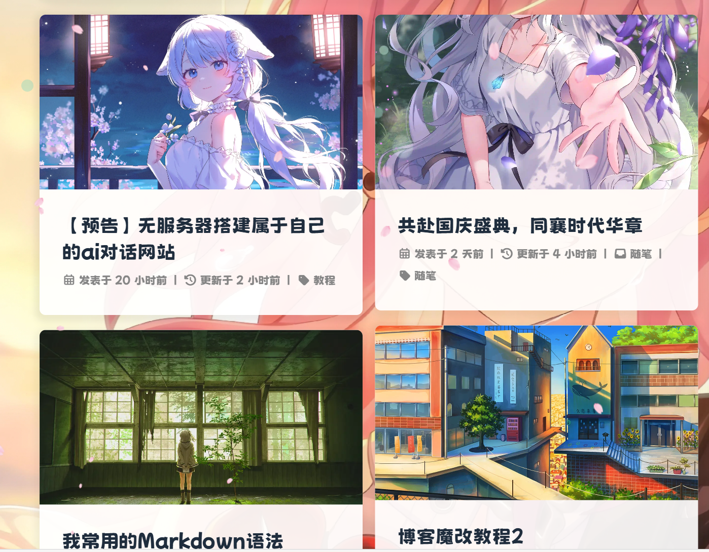
查看教程
blue

引入阿里iconfont自定义图标
查看教程
blue
一、新建图标项目
- 访问阿里巴巴矢量图标库,注册登录。
- 搜索自己想要的图标,然后选择添加入库,加到购物车。
- 选择完毕后点击右上角的购物车图标,打开侧栏,选择添加到项目,没有项目就新建一个。
- 可以通过上方资源管理->我的项目,找到之前添加的图标项目。(现在的iconfont可以在图标库的项目设置里直接打开彩色设置,然后采用fontclass的引用方式即可使用多彩图标。但是单一项目彩色图标上限是40个图标,酌情采用。)
二、 引入图标
- 复制你的font class代码和symbol代码并引入到主题文件
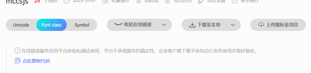
inject:
 head:
   - <link rel="stylesheet" href="这里填写font class项" media="defer" onload="this.media='all'">
 bottom:
- <script async src="这里填写sybol项"></script>- 可以在自定义
CSS中添加如下样式来控制图标默认大小和颜色等属性(若已经在项目设置中勾选了彩色选项,则无需再定义图标颜色)
.iconfont {
  font-family: "iconfont" !important;
  /* 这里可以自定义图标大小 */
  font-size: 3em;
  font-style: normal;
  -webkit-font-smoothing: antialiased;
  -moz-osx-font-smoothing: grayscale;
}
三. 菜单栏多色动态图标
请确保您已经完成了前置教程,并实现了在文章中使用symbol写法来引入iconfont图标
- 替换
themes\butterfly\layout\includes\header\menu_item.pug为以下代码,本方案默认使用观感最佳的悬停父元素触发子元素动画效果,默认动画为faa-tada。注意:可以把之前的代码注释掉,再在后面加上如下代码,以便于回滚
if theme.menu
 .menus_items
   each value, label in theme.menu
     if typeof value !== 'object'
       .menus_item
         - const valueArray = value.split('||')
         a.site-page.faa-parent.animated-hover(href=url_for(trim(value.split('||')[0])))
           if valueArray[1]
             i.fa-fw(class=trim(valueArray[1]))
             - var icon_value = trim(value.split('||')[1])
             - var anima_value = value.split('||')[2] ? trim(value.split('||')[2]) : 'faa-tada'
             if icon_value.substring(0,2)=="fa"
               i.fa-fw(class=icon_value + ' ' + anima_value)
             else if icon_value.substring(0,4)=="icon"
               svg.icon(aria-hidden="true" class=anima_value)
                 use(xlink:href=`#`+ icon_value)
           span=' '+label
     else
       .menus_item
         - const labelArray = label.split('||')
         - const hideClass = labelArray[3] && trim(labelArray[3]) === 'hide' ? 'hide' : ''
         a.site-page.group.faa-parent.animated-hover(class=`${hideClass}` href='javascript:void(0);')
           if labelArray[1]
             - var icon_label = trim(label.split('||')[1])
             - var anima_label = label.split('||')[2] ? trim(label.split('||')[2]) : 'faa-tada'
             if icon_label.substring(0,2)=="fa"
               i.fa-fw(class=icon_label + ' ' + anima_label)
             else if icon_label.substring(0,4)=="icon"
               svg.icon(aria-hidden="true" class=anima_label)
                 use(xlink:href=`#`+ icon_label)
           span=' '+ trim(labelArray[0])
           i.fas.fa-chevron-down
         ul.menus_item_child
           each val,lab in value
             - const valArray = val.split('||')
             li
               a.site-page.child.faa-parent.animated-hover(href=url_for(trim(val.split('||')[0])))
                 if valArray[1]
                   - var icon_val = trim(val.split('||')[1])
                   - var anima_val = val.split('||')[2] ? trim(val.split('||')[2]) : 'faa-tada'
                   if icon_val.substring(0,2)=="fa"
                     i.fa-fw(class=icon_val + ' ' + anima_val)
                   else if icon_val.substring(0,4)=="icon"
                     svg.icon(aria-hidden="true" class=anima_val)
                       use(xlink:href=`#`+ icon_val)
span=' '+ lab- 以下是填写示例,在
_config.butterfly.yml中修改。icon-xxx字样的为iconfont的symbol引入方案的id值,可以在你的iconfont图标库内查询,其中hide属性也是可以用的。
menu:
首页: / || icon-home || faa-tada
文章 || icon--article || faa-tada || hide:
归档: /archives/ || icon-guidang1 || faa-tada
标签: /tags/ || icon-sekuaibiaoqian || faa-tada
分类: /categories/ || icon-fenlei || faa-tada - 这里的动态图标是
svg.icon的标签,因此上面调节.iconfont的css并不适用,需要在custom.css里加上一些样式来限制图标的大小和颜色等,具体大小自行调节。
svg.icon {
  width: 1.28em;
  height: 1.28em;
  vertical-align: -0.15em;
  fill: currentColor;
  overflow: hidden;
}
修改完在手机上是默认展开二级栏的,可以在后面➕hide:收起,例:
  文章|| icon-book || faa-tada || hide:
    归档: /archives/ || icon-archive || faa-tada
    标签: /tags/ || icon-tag || faa-tada
分类: /categories/ || icon-fenlei || faa-tada- 重启项目即可看到效果:
hexo cl;hexo g;hexo s顶部加载条
查看教程
blue
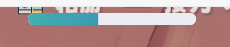
顶部细线加载条
详见:给Butterfly加上顶部加载条 引入css
.pace {
  -webkit-pointer-events: none;
  pointer-events: none;
  -webkit-user-select: none;
  -moz-user-select: none;
  user-select: none;
}

.pace-inactive {
  display: none;
}

.pace .pace-progress {
  background: #e90f92;
  position: fixed;
  z-index: 2000;
  top: 0;
  right: 100%;
  width: 100%;
  height: 2px;
}

.pace .pace-progress-inner {
  display: block;
  position: absolute;
  right: 0px;
  width: 100px;
  height: 100%;
  box-shadow: 0 0 10px #e90f92, 0 0 5px #e90f92;
  opacity: 1.0;
  -webkit-transform: rotate(3deg) translate(0px, -4px);
  -moz-transform: rotate(3deg) translate(0px, -4px);
  -ms-transform: rotate(3deg) translate(0px, -4px);
  -o-transform: rotate(3deg) translate(0px, -4px);
  transform: rotate(3deg) translate(0px, -4px);
}

.pace .pace-activity {
  display: block;
  position: fixed;
  z-index: 2000;
  top: 15px;
  right: 15px;
  width: 14px;
  height: 14px;
  border: solid 2px transparent;
  border-top-color: #e90f92;
  border-left-color: #e90f92;
  border-radius: 10px;
  -webkit-animation: pace-spinner 400ms linear infinite;
  -moz-animation: pace-spinner 400ms linear infinite;
  -ms-animation: pace-spinner 400ms linear infinite;
  -o-animation: pace-spinner 400ms linear infinite;
  animation: pace-spinner 400ms linear infinite;
}

@-webkit-keyframes pace-spinner {
  0% { -webkit-transform: rotate(0deg); transform: rotate(0deg); }
  100% { -webkit-transform: rotate(360deg); transform: rotate(360deg); }
}
@-moz-keyframes pace-spinner {
  0% { -moz-transform: rotate(0deg); transform: rotate(0deg); }
  100% { -moz-transform: rotate(360deg); transform: rotate(360deg); }
}
@-o-keyframes pace-spinner {
  0% { -o-transform: rotate(0deg); transform: rotate(0deg); }
  100% { -o-transform: rotate(360deg); transform: rotate(360deg); }
}
@-ms-keyframes pace-spinner {
  0% { -ms-transform: rotate(0deg); transform: rotate(0deg); }
  100% { -ms-transform: rotate(360deg); transform: rotate(360deg); }
}
@keyframes pace-spinner {
  0% { transform: rotate(0deg); transform: rotate(0deg); }
  100% { transform: rotate(360deg); transform: rotate(360deg); }
}
/* 在下面修改进度条外观 */
.pace .pace-progress {
  background: #1ef4fbec; /*进度条颜色*/
  height: 3px;/* 进度条厚度 */
}
.pace .pace-progress-inner {
  box-shadow: 0 0 10px #1ef4fbce, 0 0 5px #1ecffbd0; /*阴影颜色*/
}
.pace .pace-activity {
  border-top-color: #1edafbe5;	/*上边框颜色*/
  border-left-color: #1ef4fbec;	/*左边框颜色*/
}
引入js(建议保存到本地引入)
<script src="//cdn.bootcss.com/pace/1.0.2/pace.min.js"></script>新版顶部胶囊加载条(本站使用中)
- 添加css(注意,两款加载条二选一,不要同时用)
/* 加载条 */
.pace {
    -webkit-pointer-events: none;
    pointer-events: none;
    -webkit-user-select: none;
    -moz-user-select: none;
    user-select: none;
    z-index: 2000;
    position: fixed;
    margin: auto;
    top: 4px;
    left: 0;
    right: 0;
    height: 8px;
    border-radius: 8px;
    width: 7rem;
    background: #eaecf2;
    border: 1px #e3e8f7;
    overflow: hidden
}

.pace-inactive .pace-progress {
    opacity: 0;
    transition: .3s ease-in
}

.pace .pace-progress {
    -webkit-box-sizing: border-box;
    -moz-box-sizing: border-box;
    -ms-box-sizing: border-box;
    -o-box-sizing: border-box;
    box-sizing: border-box;
    -webkit-transform: translate3d(0, 0, 0);
    -moz-transform: translate3d(0, 0, 0);
    -ms-transform: translate3d(0, 0, 0);
    -o-transform: translate3d(0, 0, 0);
    transform: translate3d(0, 0, 0);
    max-width: 200px;
    position: absolute;
    z-index: 2000;
    display: block;
    top: 0;
    right: 100%;
    height: 100%;
    width: 100%;
    /* linear-gradient(to right, #3494e6, #ec6ead) */
    background: linear-gradient(to right, #43cea2, #3866ca);
    animation: gradient 2s ease infinite;
    background-size: 200%
}

.pace.pace-inactive {
    opacity: 0;
    transition: .3s;
    top: -8px
}
然后引入新版js,依然推荐保存到本地引入
- <script async src="//npm.elemecdn.com/pace-js@1.2.4/pace.min.js"></script>最后三连刷新就能看到了
hexo cl;hexo g;hexo s博客添加弹窗公告
查看教程
blue
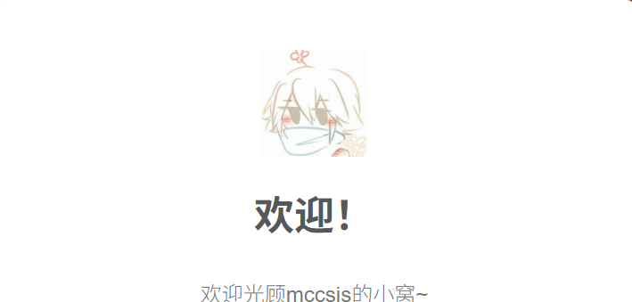
- 新建
/css/gg.css,在css中引入以下代码:(只推荐新建,不推荐粘贴到已有的CSS中)
.sweet-alert,.sweet-overlay{position:fixed;display:none}body.stop-scrolling{height:100%;overflow:hidden}.sweet-overlay{background-color:#000;-ms-filter:"progid:DXImageTransform.Microsoft.Alpha(Opacity=40)";background-color:rgba(0,0,0,.4);left:0;right:0;top:0;bottom:0;z-index:10000}.sweet-alert{background-color:#fff;font-family:'Open Sans','Helvetica Neue',Helvetica,Arial,sans-serif;width:478px;padding:17px;border-radius:5px;text-align:center;left:50%;top:50%;margin-left:-256px;margin-top:-200px;overflow:hidden;z-index:99999}@media all and (max-width:540px){.sweet-alert{width:auto;margin-left:0;margin-right:0;left:15px;right:15px}}.sweet-alert h2{color:#575757;font-size:30px;text-align:center;font-weight:600;text-transform:none;position:relative;margin:25px 0;padding:0;line-height:40px;display:block}.sweet-alert p{color:#797979;font-size:16px;font-weight:300;position:relative;text-align:inherit;float:none;margin:0;padding:0;line-height:normal}.sweet-alert fieldset{border:none;position:relative}.sweet-alert .sa-error-container{background-color:#f1f1f1;margin-left:-17px;margin-right:-17px;overflow:hidden;padding:0 10px;max-height:0;webkit-transition:padding .15s,max-height .15s;transition:padding .15s,max-height .15s}.sweet-alert .sa-error-container.show{padding:10px 0;max-height:100px;webkit-transition:padding .2s,max-height .2s;transition:padding .25s,max-height .25s}.sweet-alert .sa-error-container .icon{display:inline-block;width:24px;height:24px;border-radius:50%;background-color:#ea7d7d;color:#fff;line-height:24px;text-align:center;margin-right:3px}.sweet-alert .sa-error-container p{display:inline-block}.sweet-alert .sa-input-error{position:absolute;top:29px;right:26px;width:20px;height:20px;opacity:0;-webkit-transform:scale(.5);transform:scale(.5);-webkit-transform-origin:50% 50%;transform-origin:50% 50%;-webkit-transition:all .1s;transition:all .1s}.sweet-alert .sa-input-error::after,.sweet-alert .sa-input-error::before{content:"";width:20px;height:6px;background-color:#f06e57;border-radius:3px;position:absolute;top:50%;margin-top:-4px;left:50%;margin-left:-9px}.sweet-alert .sa-input-error::before{-webkit-transform:rotate(-45deg);transform:rotate(-45deg)}.sweet-alert .sa-input-error::after{-webkit-transform:rotate(45deg);transform:rotate(45deg)}.sweet-alert .sa-input-error.show{opacity:1;-webkit-transform:scale(1);transform:scale(1)}.sweet-alert input{width:100%;box-sizing:border-box;border-radius:3px;border:1px solid #d7d7d7;height:43px;margin-top:10px;margin-bottom:17px;font-size:18px;box-shadow:inset 0 1px 1px rgba(0,0,0,.06);padding:0 12px;display:none;-webkit-transition:all .3s;transition:all .3s}.sweet-alert input:focus{outline:0;box-shadow:0 0 3px #c4e6f5;border:1px solid #b4dbed}.sweet-alert input:focus::-moz-placeholder{transition:opacity .3s 30ms ease;opacity:.5}.sweet-alert input:focus:-ms-input-placeholder{transition:opacity .3s 30ms ease;opacity:.5}.sweet-alert input:focus::-webkit-input-placeholder{transition:opacity .3s 30ms ease;opacity:.5}.sweet-alert input::-moz-placeholder{color:#bdbdbd}.sweet-alert input:-ms-input-placeholder{color:#bdbdbd}.sweet-alert input::-webkit-input-placeholder{color:#bdbdbd}.sweet-alert.show-input input{display:block}.sweet-alert .sa-confirm-button-container{display:inline-block;position:relative}.sweet-alert .la-ball-fall{position:absolute;left:50%;top:50%;margin-left:-27px;margin-top:4px;opacity:0;visibility:hidden}.sweet-alert button{background-color:#8CD4F5;color:#fff;border:none;box-shadow:none;font-size:17px;font-weight:500;-webkit-border-radius:4px;border-radius:5px;padding:10px 32px;margin:26px 5px 0;cursor:pointer}.sweet-alert button:focus{outline:0;box-shadow:0 0 2px rgba(128,179,235,.5),inset 0 0 0 1px rgba(0,0,0,.05)}.sweet-alert button:hover{background-color:#7ecff4}.sweet-alert button:active{background-color:#5dc2f1}.sweet-alert button.cancel{background-color:#C1C1C1}.sweet-alert button.cancel:hover{background-color:#b9b9b9}.sweet-alert button.cancel:active{background-color:#a8a8a8}.sweet-alert button.cancel:focus{box-shadow:rgba(197,205,211,.8) 0 0 2px,rgba(0,0,0,.0470588) 0 0 0 1px inset!important}.sweet-alert button[disabled]{opacity:.6;cursor:default}.sweet-alert button.confirm[disabled]{color:transparent}.sweet-alert button.confirm[disabled]~.la-ball-fall{opacity:1;visibility:visible;transition-delay:0s}.sweet-alert button::-moz-focus-inner{border:0}.sweet-alert[data-has-cancel-button=false] button{box-shadow:none!important}.sweet-alert[data-has-confirm-button=false][data-has-cancel-button=false]{padding-bottom:40px}.sweet-alert .sa-icon{width:80px;height:80px;border:4px solid gray;-webkit-border-radius:40px;border-radius:50%;margin:20px auto;padding:0;position:relative;box-sizing:content-box}.sweet-alert .sa-icon.sa-error{border-color:#F27474}.sweet-alert .sa-icon.sa-error .sa-x-mark{position:relative;display:block}.sweet-alert .sa-icon.sa-error .sa-line{position:absolute;height:5px;width:47px;background-color:#F27474;display:block;top:37px;border-radius:2px}.sweet-alert .sa-icon.sa-error .sa-line.sa-left{-webkit-transform:rotate(45deg);transform:rotate(45deg);left:17px}.sweet-alert .sa-icon.sa-error .sa-line.sa-right{-webkit-transform:rotate(-45deg);transform:rotate(-45deg);right:16px}.sweet-alert .sa-icon.sa-warning{border-color:#F8BB86}.sweet-alert .sa-icon.sa-warning .sa-body{position:absolute;width:5px;height:47px;left:50%;top:10px;-webkit-border-radius:2px;border-radius:2px;margin-left:-2px;background-color:#F8BB86}.sweet-alert .sa-icon.sa-warning .sa-dot{position:absolute;width:7px;height:7px;-webkit-border-radius:50%;border-radius:50%;margin-left:-3px;left:50%;bottom:10px;background-color:#F8BB86}.sweet-alert .sa-icon.sa-info::after,.sweet-alert .sa-icon.sa-info::before{content:"";background-color:#C9DAE1;position:absolute}.sweet-alert .sa-icon.sa-info{border-color:#C9DAE1}.sweet-alert .sa-icon.sa-info::before{width:5px;height:29px;left:50%;bottom:17px;border-radius:2px;margin-left:-2px}.sweet-alert .sa-icon.sa-info::after{width:7px;height:7px;border-radius:50%;margin-left:-3px;top:19px}.sweet-alert .sa-icon.sa-success{border-color:#A5DC86}.sweet-alert .sa-icon.sa-success::after,.sweet-alert .sa-icon.sa-success::before{content:'';position:absolute;width:60px;height:120px;background:#fff}.sweet-alert .sa-icon.sa-success::before{-webkit-border-radius:120px 0 0 120px;border-radius:120px 0 0 120px;top:-7px;left:-33px;-webkit-transform:rotate(-45deg);transform:rotate(-45deg);-webkit-transform-origin:60px 60px;transform-origin:60px 60px}.sweet-alert .sa-icon.sa-success::after{-webkit-border-radius:0 120px 120px 0;border-radius:0 120px 120px 0;top:-11px;left:30px;-webkit-transform:rotate(-45deg);transform:rotate(-45deg);-webkit-transform-origin:0 60px;transform-origin:0 60px}.sweet-alert .sa-icon.sa-success .sa-placeholder{width:80px;height:80px;border:4px solid rgba(165,220,134,.2);-webkit-border-radius:40px;border-radius:50%;box-sizing:content-box;position:absolute;left:-4px;top:-4px;z-index:2}.sweet-alert .sa-icon.sa-success .sa-fix{width:5px;height:90px;background-color:#fff;position:absolute;left:28px;top:8px;z-index:1;-webkit-transform:rotate(-45deg);transform:rotate(-45deg)}.sweet-alert .sa-icon.sa-success .sa-line{height:5px;background-color:#A5DC86;display:block;border-radius:2px;position:absolute;z-index:2}.sweet-alert .sa-icon.sa-success .sa-line.sa-tip{width:25px;left:14px;top:46px;-webkit-transform:rotate(45deg);transform:rotate(45deg)}.sweet-alert .sa-icon.sa-success .sa-line.sa-long{width:47px;right:8px;top:38px;-webkit-transform:rotate(-45deg);transform:rotate(-45deg)}.sweet-alert .sa-icon.sa-custom{background-size:contain;border-radius:0;border:none;background-position:center center;background-repeat:no-repeat}@-webkit-keyframes showSweetAlert{0%{transform:scale(.7);-webkit-transform:scale(.7)}45%{transform:scale(1.05);-webkit-transform:scale(1.05)}80%{transform:scale(.95);-webkit-transform:scale(.95)}100%{transform:scale(1);-webkit-transform:scale(1)}}@keyframes showSweetAlert{0%{transform:scale(.7);-webkit-transform:scale(.7)}45%{transform:scale(1.05);-webkit-transform:scale(1.05)}80%{transform:scale(.95);-webkit-transform:scale(.95)}100%{transform:scale(1);-webkit-transform:scale(1)}}@-webkit-keyframes hideSweetAlert{0%{transform:scale(1);-webkit-transform:scale(1)}100%{transform:scale(.5);-webkit-transform:scale(.5)}}@keyframes hideSweetAlert{0%{transform:scale(1);-webkit-transform:scale(1)}100%{transform:scale(.5);-webkit-transform:scale(.5)}}@-webkit-keyframes slideFromTop{0%{top:0}100%{top:50%}}@keyframes slideFromTop{0%{top:0}100%{top:50%}}@-webkit-keyframes slideToTop{0%{top:50%}100%{top:0}}@keyframes slideToTop{0%{top:50%}100%{top:0}}@-webkit-keyframes slideFromBottom{0%{top:70%}100%{top:50%}}@keyframes slideFromBottom{0%{top:70%}100%{top:50%}}@-webkit-keyframes slideToBottom{0%{top:50%}100%{top:70%}}@keyframes slideToBottom{0%{top:50%}100%{top:70%}}.showSweetAlert[data-animation=pop]{-webkit-animation:showSweetAlert .3s;animation:showSweetAlert .3s}.showSweetAlert[data-animation=none]{-webkit-animation:none;animation:none}.showSweetAlert[data-animation=slide-from-top]{-webkit-animation:slideFromTop .3s;animation:slideFromTop .3s}.showSweetAlert[data-animation=slide-from-bottom]{-webkit-animation:slideFromBottom .3s;animation:slideFromBottom .3s}.hideSweetAlert[data-animation=pop]{-webkit-animation:hideSweetAlert .2s;animation:hideSweetAlert .2s}.hideSweetAlert[data-animation=none]{-webkit-animation:none;animation:none}.hideSweetAlert[data-animation=slide-from-top]{-webkit-animation:slideToTop .4s;animation:slideToTop .4s}.hideSweetAlert[data-animation=slide-from-bottom]{-webkit-animation:slideToBottom .3s;animation:slideToBottom .3s}@-webkit-keyframes animateSuccessTip{0%,54%{width:0;left:1px;top:19px}70%{width:50px;left:-8px;top:37px}84%{width:17px;left:21px;top:48px}100%{width:25px;left:14px;top:45px}}@keyframes animateSuccessTip{0%,54%{width:0;left:1px;top:19px}70%{width:50px;left:-8px;top:37px}84%{width:17px;left:21px;top:48px}100%{width:25px;left:14px;top:45px}}@-webkit-keyframes animateSuccessLong{0%,65%{width:0;right:46px;top:54px}84%{width:55px;right:0;top:35px}100%{width:47px;right:8px;top:38px}}@keyframes animateSuccessLong{0%,65%{width:0;right:46px;top:54px}84%{width:55px;right:0;top:35px}100%{width:47px;right:8px;top:38px}}@-webkit-keyframes rotatePlaceholder{0%,5%{transform:rotate(-45deg);-webkit-transform:rotate(-45deg)}100%,12%{transform:rotate(-405deg);-webkit-transform:rotate(-405deg)}}@keyframes rotatePlaceholder{0%,5%{transform:rotate(-45deg);-webkit-transform:rotate(-45deg)}100%,12%{transform:rotate(-405deg);-webkit-transform:rotate(-405deg)}}.animateSuccessTip{-webkit-animation:animateSuccessTip .75s;animation:animateSuccessTip .75s}.animateSuccessLong{-webkit-animation:animateSuccessLong .75s;animation:animateSuccessLong .75s}.sa-icon.sa-success.animate::after{-webkit-animation:rotatePlaceholder 4.25s ease-in;animation:rotatePlaceholder 4.25s ease-in}@-webkit-keyframes animateErrorIcon{0%{transform:rotateX(100deg);-webkit-transform:rotateX(100deg);opacity:0}100%{transform:rotateX(0);-webkit-transform:rotateX(0);opacity:1}}@keyframes animateErrorIcon{0%{transform:rotateX(100deg);-webkit-transform:rotateX(100deg);opacity:0}100%{transform:rotateX(0);-webkit-transform:rotateX(0);opacity:1}}.animateErrorIcon{-webkit-animation:animateErrorIcon .5s;animation:animateErrorIcon .5s}@-webkit-keyframes animateXMark{0%,50%{transform:scale(.4);-webkit-transform:scale(.4);margin-top:26px;opacity:0}80%{transform:scale(1.15);-webkit-transform:scale(1.15);margin-top:-6px}100%{transform:scale(1);-webkit-transform:scale(1);margin-top:0;opacity:1}}@keyframes animateXMark{0%,50%{transform:scale(.4);-webkit-transform:scale(.4);margin-top:26px;opacity:0}80%{transform:scale(1.15);-webkit-transform:scale(1.15);margin-top:-6px}100%{transform:scale(1);-webkit-transform:scale(1);margin-top:0;opacity:1}}.animateXMark{-webkit-animation:animateXMark .5s;animation:animateXMark .5s}@-webkit-keyframes pulseWarning{0%{border-color:#F8D486}100%{border-color:#F8BB86}}@keyframes pulseWarning{0%{border-color:#F8D486}100%{border-color:#F8BB86}}.pulseWarning{-webkit-animation:pulseWarning .75s infinite alternate;animation:pulseWarning .75s infinite alternate}@-webkit-keyframes pulseWarningIns{0%{background-color:#F8D486}100%{background-color:#F8BB86}}@keyframes pulseWarningIns{0%{background-color:#F8D486}100%{background-color:#F8BB86}}.pulseWarningIns{-webkit-animation:pulseWarningIns .75s infinite alternate;animation:pulseWarningIns .75s infinite alternate}@-webkit-keyframes rotate-loading{0%{transform:rotate(0)}100%{transform:rotate(360deg)}}@keyframes rotate-loading{0%{transform:rotate(0)}100%{transform:rotate(360deg)}}.sweet-alert .sa-icon.sa-error .sa-line.sa-left{-ms-transform:rotate(45deg)\9}.sweet-alert .sa-icon.sa-error .sa-line.sa-right{-ms-transform:rotate(-45deg)\9}.sweet-alert .sa-icon.sa-success{border-color:transparent\9}.sweet-alert .sa-icon.sa-success .sa-line.sa-tip{-ms-transform:rotate(45deg)\9}.sweet-alert .sa-icon.sa-success .sa-line.sa-long{-ms-transform:rotate(-45deg)\9}/*!

 * Load Awesome v1.1.0 (http://github.danielcardoso.net/load-awesome/)

 * Copyright 2015 Daniel Cardoso <@DanielCardoso>

 * Licensed under MIT

*/.la-ball-fall,.la-ball-fall>div{position:relative;-webkit-box-sizing:border-box;-moz-box-sizing:border-box;box-sizing:border-box}.la-ball-fall{display:block;font-size:0;color:#fff;width:54px;height:18px}.la-ball-fall.la-dark{color:#333}.la-ball-fall>div{display:inline-block;float:none;background-color:currentColor;border:0 solid currentColor;width:10px;height:10px;margin:4px;border-radius:100%;opacity:0;-webkit-animation:ball-fall 1s ease-in-out infinite;-moz-animation:ball-fall 1s ease-in-out infinite;-o-animation:ball-fall 1s ease-in-out infinite;animation:ball-fall 1s ease-in-out infinite}.la-ball-fall>div:nth-child(1){-webkit-animation-delay:-.2s;-moz-animation-delay:-.2s;-o-animation-delay:-.2s;animation-delay:-.2s}.la-ball-fall>div:nth-child(2){-webkit-animation-delay:-.1s;-moz-animation-delay:-.1s;-o-animation-delay:-.1s;animation-delay:-.1s}.la-ball-fall>div:nth-child(3){-webkit-animation-delay:0s;-moz-animation-delay:0s;-o-animation-delay:0s;animation-delay:0s}.la-ball-fall.la-sm{width:26px;height:8px}.la-ball-fall.la-sm>div{width:4px;height:4px;margin:2px}.la-ball-fall.la-2x{width:108px;height:36px}.la-ball-fall.la-2x>div{width:20px;height:20px;margin:8px}.la-ball-fall.la-3x{width:162px;height:54px}.la-ball-fall.la-3x>div{width:30px;height:30px;margin:12px}@-webkit-keyframes ball-fall{0%{opacity:0;-webkit-transform:translateY(-145%);transform:translateY(-145%)}10%,90%{opacity:.5}20%,80%{opacity:1;-webkit-transform:translateY(0);transform:translateY(0)}100%{opacity:0;-webkit-transform:translateY(145%);transform:translateY(145%)}}@-moz-keyframes ball-fall{0%{opacity:0;-moz-transform:translateY(-145%);transform:translateY(-145%)}10%,90%{opacity:.5}20%,80%{opacity:1;-moz-transform:translateY(0);transform:translateY(0)}100%{opacity:0;-moz-transform:translateY(145%);transform:translateY(145%)}}@-o-keyframes ball-fall{0%{opacity:0;-o-transform:translateY(-145%);transform:translateY(-145%)}10%,90%{opacity:.5}20%,80%{opacity:1;-o-transform:translateY(0);transform:translateY(0)}100%{opacity:0;-o-transform:translateY(145%);transform:translateY(145%)}}@keyframes ball-fall{0%{opacity:0;-webkit-transform:translateY(-145%);-moz-transform:translateY(-145%);-o-transform:translateY(-145%);transform:translateY(-145%)}10%,90%{opacity:.5}20%,80%{opacity:1;-webkit-transform:translateY(0);-moz-transform:translateY(0);-o-transform:translateY(0);transform:translateY(0)}100%{opacity:0;-webkit-transform:translateY(145%);-moz-transform:translateY(145%);-o-transform:translateY(145%);transform:translateY(145%)}}- 新建
/js/gg.js并加入以下代码:
!function(w,C,S){"use strict";!function o(a,r,s){function l(n,e){if(!r[n]){if(!a[n]){var t="function"==typeof require&&require;if(!e&&t)return t(n,!0);if(i)return i(n,!0);e=new Error("Cannot find module '"+n+"'");throw e.code="MODULE_NOT_FOUND",e}t=r[n]={exports:{}};a[n][0].call(t.exports,function(e){var t=a[n][1][e];return l(t||e)},t,t.exports,o,a,r,s)}return r[n].exports}for(var i="function"==typeof require&&require,e=0;e<s.length;e++)l(s[e]);return l}({1:[function(e,t,n){function o(e){return e&&e.__esModule?e:{default:e}}Object.defineProperty(n,"__esModule",{value:!0});var c,d,a,f,p=e("./modules/handle-dom"),m=e("./modules/utils"),y=e("./modules/handle-swal-dom"),v=e("./modules/handle-click"),h=o(e("./modules/handle-key")),b=o(e("./modules/default-params")),g=o(e("./modules/set-params"));n.default=a=f=function(){var t=arguments[0];function e(e){return(t[e]===S?b.default:t)[e]}if(p.addClass(C.body,"stop-scrolling"),y.resetInput(),t===S)return m.logStr("SweetAlert expects at least 1 attribute!"),!1;var n=m.extend({},b.default);switch(typeof t){case"string":n.title=t,n.text=arguments[1]||"",n.type=arguments[2]||"";break;case"object":if(t.title===S)return m.logStr('Missing "title" argument!'),!1;for(var o in n.title=t.title,b.default)n[o]=e(o);n.confirmButtonText=n.showCancelButton?"Confirm":b.default.confirmButtonText,n.confirmButtonText=e("confirmButtonText"),n.doneFunction=arguments[1]||null;break;default:return m.logStr('Unexpected type of argument! Expected "string" or "object", got '+typeof t),!1}g.default(n),y.fixVerticalPosition(),y.openModal(arguments[1]);for(var a=y.getModal(),r=a.querySelectorAll("button"),s=["onclick","onmouseover","onmouseout","onmousedown","onmouseup","onfocus"],l=function(e){return v.handleButton(e,n,a)},i=0;i<r.length;i++)for(var u=0;u<s.length;u++)r[i][s[u]]=l;y.getOverlay().onclick=l,c=w.onkeydown;w.onkeydown=function(e){return h.default(e,n,a)},w.onfocus=function(){setTimeout(function(){d!==S&&(d.focus(),d=S)},0)},f.enableButtons()},a.setDefaults=f.setDefaults=function(e){if(!e)throw new Error("userParams is required");if("object"!=typeof e)throw new Error("userParams has to be a object");m.extend(b.default,e)},a.close=f.close=function(){var t=y.getModal(),e=(p.fadeOut(y.getOverlay(),5),p.fadeOut(t,5),p.removeClass(t,"showSweetAlert"),p.addClass(t,"hideSweetAlert"),p.removeClass(t,"visible"),t.querySelector(".sa-icon.sa-success")),e=(p.removeClass(e,"animate"),p.removeClass(e.querySelector(".sa-tip"),"animateSuccessTip"),p.removeClass(e.querySelector(".sa-long"),"animateSuccessLong"),t.querySelector(".sa-icon.sa-error")),e=(p.removeClass(e,"animateErrorIcon"),p.removeClass(e.querySelector(".sa-x-mark"),"animateXMark"),t.querySelector(".sa-icon.sa-warning"));return p.removeClass(e,"pulseWarning"),p.removeClass(e.querySelector(".sa-body"),"pulseWarningIns"),p.removeClass(e.querySelector(".sa-dot"),"pulseWarningIns"),setTimeout(function(){var e=t.getAttribute("data-custom-class");p.removeClass(t,e)},300),p.removeClass(C.body,"stop-scrolling"),w.onkeydown=c,w.previousActiveElement&&w.previousActiveElement.focus(),d=S,clearTimeout(t.timeout),!0},a.showInputError=f.showInputError=function(e){var t=y.getModal(),n=t.querySelector(".sa-input-error"),n=(p.addClass(n,"show"),t.querySelector(".sa-error-container"));p.addClass(n,"show"),n.querySelector("p").innerHTML=e,setTimeout(function(){a.enableButtons()},1),t.querySelector("input").focus()},a.resetInputError=f.resetInputError=function(e){if(e&&13===e.keyCode)return!1;var e=y.getModal(),t=e.querySelector(".sa-input-error"),t=(p.removeClass(t,"show"),e.querySelector(".sa-error-container"));p.removeClass(t,"show")},a.disableButtons=f.disableButtons=function(e){var t=y.getModal(),n=t.querySelector("button.confirm"),t=t.querySelector("button.cancel");n.disabled=!0,t.disabled=!0},a.enableButtons=f.enableButtons=function(e){var t=y.getModal(),n=t.querySelector("button.confirm"),t=t.querySelector("button.cancel");n.disabled=!1,t.disabled=!1},void 0!==w?w.sweetAlert=w.swal=a:m.logStr("SweetAlert is a frontend module!"),t.exports=n.default},{"./modules/default-params":2,"./modules/handle-click":3,"./modules/handle-dom":4,"./modules/handle-key":5,"./modules/handle-swal-dom":6,"./modules/set-params":8,"./modules/utils":9}],2:[function(e,t,n){Object.defineProperty(n,"__esModule",{value:!0});n.default={title:"",text:"",type:null,allowOutsideClick:!1,showConfirmButton:!0,showCancelButton:!1,closeOnConfirm:!0,closeOnCancel:!0,confirmButtonText:"OK",confirmButtonColor:"#8CD4F5",cancelButtonText:"Cancel",imageUrl:null,imageSize:null,timer:null,customClass:"",html:!1,animation:!0,allowEscapeKey:!0,inputType:"text",inputPlaceholder:"",inputValue:"",showLoaderOnConfirm:!1},t.exports=n.default},{}],3:[function(e,t,n){Object.defineProperty(n,"__esModule",{value:!0});function m(e,t){var n=!0;h.hasClass(e,"show-input")&&(n=(n=e.querySelector("input").value)||""),t.doneFunction(n),t.closeOnConfirm&&sweetAlert.close(),t.showLoaderOnConfirm&&sweetAlert.disableButtons()}function y(e,t){var n=String(t.doneFunction).replace(/\s/g,"");"function("===n.substring(0,9)&&")"!==n.substring(9,10)&&t.doneFunction(!1),t.closeOnCancel&&sweetAlert.close()}var v=e("./utils"),h=(e("./handle-swal-dom"),e("./handle-dom"));n.default={handleButton:function(e,t,n){var o,a,r,e=e||w.event,s=e.target||e.srcElement,l=-1!==s.className.indexOf("confirm"),i=-1!==s.className.indexOf("sweet-overlay"),u=h.hasClass(n,"visible"),c=t.doneFunction&&"true"===n.getAttribute("data-has-done-function");function d(e){l&&t.confirmButtonColor&&(s.style.backgroundColor=e)}switch(l&&t.confirmButtonColor&&(o=t.confirmButtonColor,a=v.colorLuminance(o,-.04),r=v.colorLuminance(o,-.14)),e.type){case"mouseover":d(a);break;case"mouseout":d(o);break;case"mousedown":d(r);break;case"mouseup":d(a);break;case"focus":var f=n.querySelector("button.confirm"),p=n.querySelector("button.cancel");l?p.style.boxShadow="none":f.style.boxShadow="none";break;case"click":p=n===s,f=h.isDescendant(n,s);if(!p&&!f&&u&&!t.allowOutsideClick)break;l&&c&&u?m(n,t):c&&u||i?y(0,t):h.isDescendant(n,s)&&"BUTTON"===s.tagName&&sweetAlert.close()}},handleConfirm:m,handleCancel:y},t.exports=n.default},{"./handle-dom":4,"./handle-swal-dom":6,"./utils":9}],4:[function(e,t,n){Object.defineProperty(n,"__esModule",{value:!0});function o(e,t){return new RegExp(" "+t+" ").test(" "+e.className+" ")}function a(e){e.style.opacity="",e.style.display="block"}function r(e){e.style.opacity="",e.style.display="none"}n.hasClass=o,n.addClass=function(e,t){o(e,t)||(e.className+=" "+t)},n.removeClass=function(e,t){var n=" "+e.className.replace(/[\t\r\n]/g," ")+" ";if(o(e,t)){for(;0<=n.indexOf(" "+t+" ");)n=n.replace(" "+t+" "," ");e.className=n.replace(/^\s+|\s+$/g,"")}},n.escapeHtml=function(e){var t=C.createElement("div");return t.appendChild(C.createTextNode(e)),t.innerHTML},n._show=a,n.show=function(e){if(e&&!e.length)return a(e);for(var t=0;t<e.length;++t)a(e[t])},n._hide=r,n.hide=function(e){if(e&&!e.length)return r(e);for(var t=0;t<e.length;++t)r(e[t])},n.isDescendant=function(e,t){for(var n=t.parentNode;null!==n;){if(n===e)return!0;n=n.parentNode}return!1},n.getTopMargin=function(e){e.style.left="-9999px",e.style.display="block";var t=e.clientHeight,n="undefined"!=typeof getComputedStyle?parseInt(getComputedStyle(e).getPropertyValue("padding-top"),10):parseInt(e.currentStyle.padding);return e.style.left="",e.style.display="none","-"+parseInt((t+n)/2)+"px"},n.fadeIn=function(e,t){var n,o,a;function r(){return a.apply(this,arguments)}+e.style.opacity<1&&(t=t||16,e.style.opacity=0,e.style.display="block",n=+new Date,a=function(){e.style.opacity=+e.style.opacity+(new Date-n)/100,n=+new Date,+e.style.opacity<1&&setTimeout(o,t)},r.toString=function(){return a.toString()},(o=r)()),e.style.display="block"},n.fadeOut=function(e,t){t=t||16,e.style.opacity=1;var n,o=+new Date,a=(n=function(){e.style.opacity=+e.style.opacity-(new Date-o)/100,o=+new Date,0<+e.style.opacity?setTimeout(a,t):e.style.display="none"},r.toString=function(){return n.toString()},r);function r(){return n.apply(this,arguments)}a()},n.fireClick=function(e){var t;"function"==typeof MouseEvent?(t=new MouseEvent("click",{view:w,bubbles:!1,cancelable:!0}),e.dispatchEvent(t)):C.createEvent?((t=C.createEvent("MouseEvents")).initEvent("click",!1,!1),e.dispatchEvent(t)):C.createEventObject?e.fireEvent("onclick"):"function"==typeof e.onclick&&e.onclick()},n.stopEventPropagation=function(e){"function"==typeof e.stopPropagation?(e.stopPropagation(),e.preventDefault()):w.event&&w.event.hasOwnProperty("cancelBubble")&&(w.event.cancelBubble=!0)}},{}],5:[function(e,t,n){Object.defineProperty(n,"__esModule",{value:!0});var c=e("./handle-dom"),d=e("./handle-swal-dom");n.default=function(e,t,n){var e=e||w.event,o=e.keyCode||e.which,a=n.querySelector("button.confirm"),r=n.querySelector("button.cancel"),s=n.querySelectorAll("button[tabindex]");if(-1!==[9,13,32,27].indexOf(o)){for(var l=e.target||e.srcElement,i=-1,u=0;u<s.length;u++)if(l===s[u]){i=u;break}9===o?(l=-1===i?a:i===s.length-1?s[0]:s[i+1],c.stopEventPropagation(e),l.focus(),t.confirmButtonColor&&d.setFocusStyle(l,t.confirmButtonColor)):13===o?"INPUT"===l.tagName&&(l=a).focus():27===o&&!0===t.allowEscapeKey&&c.fireClick(l=r,e)}},t.exports=n.default},{"./handle-dom":4,"./handle-swal-dom":6}],6:[function(e,t,n){function o(e){return e&&e.__esModule?e:{default:e}}function a(){var e=C.createElement("div");for(e.innerHTML=u.default;e.firstChild;)C.body.appendChild(e.firstChild)}Object.defineProperty(n,"__esModule",{value:!0});var r,s=e("./utils"),l=e("./handle-dom"),i=o(e("./default-params")),u=o(e("./injected-html")),c=(r=function(){var e=C.querySelector(".sweet-alert");return e||(a(),e=c()),e},d.toString=function(){return r.toString()},d);function d(){return r.apply(this,arguments)}function f(){var e=c();if(e)return e.querySelector("input")}function p(){return C.querySelector(".sweet-overlay")}function m(e){if(e&&13===e.keyCode)return!1;var t=(e=c()).querySelector(".sa-input-error"),t=(l.removeClass(t,"show"),e.querySelector(".sa-error-container"));l.removeClass(t,"show")}n.sweetAlertInitialize=a,n.getModal=c,n.getOverlay=p,n.getInput=f,n.setFocusStyle=function(e,t){t=s.hexToRgb(t);e.style.boxShadow="0 0 2px rgba("+t+", 0.8), inset 0 0 0 1px rgba(0, 0, 0, 0.05)"},n.openModal=function(e){var t=c();l.fadeIn(p(),10),l.show(t),l.addClass(t,"showSweetAlert"),l.removeClass(t,"hideSweetAlert"),w.previousActiveElement=C.activeElement;t.querySelector("button.confirm").focus(),setTimeout(function(){l.addClass(t,"visible")},500);var n,o=t.getAttribute("data-timer");"null"!==o&&""!==o&&(n=e,t.timeout=setTimeout(function(){(n?"true"===t.getAttribute("data-has-done-function"):null)?n(null):sweetAlert.close()},o))},n.resetInput=function(){var e=c(),t=f();l.removeClass(e,"show-input"),t.value=i.default.inputValue,t.setAttribute("type",i.default.inputType),t.setAttribute("placeholder",i.default.inputPlaceholder),m()},n.resetInputError=m,n.fixVerticalPosition=function(){c().style.marginTop=l.getTopMargin(c())}},{"./default-params":2,"./handle-dom":4,"./injected-html":7,"./utils":9}],7:[function(e,t,n){Object.defineProperty(n,"__esModule",{value:!0});n.default='<div class="sweet-overlay" tabIndex="-1"></div><div class="sweet-alert"><div class="sa-icon sa-error">\n <span class="sa-x-mark">\n <span class="sa-line sa-left"></span>\n <span class="sa-line sa-right"></span>\n </span>\n </div><div class="sa-icon sa-warning">\n <span class="sa-body"></span>\n <span class="sa-dot"></span>\n </div><div class="sa-icon sa-info"></div><div class="sa-icon sa-success">\n <span class="sa-line sa-tip"></span>\n <span class="sa-line sa-long"></span>\n\n <div class="sa-placeholder"></div>\n <div class="sa-fix"></div>\n </div><div class="sa-icon sa-custom"></div><h2>Title</h2>\n <p>Text</p>\n <fieldset>\n <input type="text" tabIndex="3" />\n <div class="sa-input-error"></div>\n </fieldset><div class="sa-error-container">\n <div class="icon">!</div>\n <p>Not valid!</p>\n </div><div class="sa-button-container">\n <button class="cancel" tabIndex="2">Cancel</button>\n <div class="sa-confirm-button-container">\n <button class="confirm" tabIndex="1">OK</button><div class="la-ball-fall">\n <div></div>\n <div></div>\n <div></div>\n </div>\n </div>\n </div></div>',t.exports=n.default},{}],8:[function(e,t,n){Object.defineProperty(n,"__esModule",{value:!0});var u=e("./utils"),c=e("./handle-swal-dom"),d=e("./handle-dom"),f=["error","warning","info","success","input","prompt"];n.default=function(a){var e,t,r=c.getModal(),n=r.querySelector("h2"),o=r.querySelector("p"),s=r.querySelector("button.cancel"),l=r.querySelector("button.confirm");if(n.innerHTML=a.html?a.title:d.escapeHtml(a.title).split("\n").join("<br>"),o.innerHTML=a.html?a.text:d.escapeHtml(a.text||"").split("\n").join("<br>"),a.text&&d.show(o),a.customClass?(d.addClass(r,a.customClass),r.setAttribute("data-custom-class",a.customClass)):(n=r.getAttribute("data-custom-class"),d.removeClass(r,n),r.setAttribute("data-custom-class","")),d.hide(r.querySelectorAll(".sa-icon")),a.type&&!u.isIE8()){var o=function(){for(var e=!1,t=0;t<f.length;t++)if(a.type===f[t]){e=!0;break}if(!e)return logStr("Unknown alert type: "+a.type),{v:!1};var n=S,o=(-1!==["success","error","warning","info"].indexOf(a.type)&&(n=r.querySelector(".sa-icon.sa-"+a.type),d.show(n)),c.getInput());switch(a.type){case"success":d.addClass(n,"animate"),d.addClass(n.querySelector(".sa-tip"),"animateSuccessTip"),d.addClass(n.querySelector(".sa-long"),"animateSuccessLong");break;case"error":d.addClass(n,"animateErrorIcon"),d.addClass(n.querySelector(".sa-x-mark"),"animateXMark");break;case"warning":d.addClass(n,"pulseWarning"),d.addClass(n.querySelector(".sa-body"),"pulseWarningIns"),d.addClass(n.querySelector(".sa-dot"),"pulseWarningIns");break;case"input":case"prompt":o.setAttribute("type",a.inputType),o.value=a.inputValue,o.setAttribute("placeholder",a.inputPlaceholder),d.addClass(r,"show-input"),setTimeout(function(){o.focus(),o.addEventListener("keyup",swal.resetInputError)},400)}}();if("object"==typeof o)return o.v}a.imageUrl&&((n=r.querySelector(".sa-icon.sa-custom")).style.backgroundImage="url("+a.imageUrl+")",d.show(n),e=o=80,a.imageSize&&(i=(t=a.imageSize.toString().split("x"))[0],t=t[1],i&&t?(o=i,e=t):logStr("Parameter imageSize expects value with format WIDTHxHEIGHT, got "+a.imageSize)),n.setAttribute("style",n.getAttribute("style")+"width:"+o+"px; height:"+e+"px")),r.setAttribute("data-has-cancel-button",a.showCancelButton),a.showCancelButton?s.style.display="inline-block":d.hide(s),r.setAttribute("data-has-confirm-button",a.showConfirmButton),a.showConfirmButton?l.style.display="inline-block":d.hide(l),a.cancelButtonText&&(s.innerHTML=d.escapeHtml(a.cancelButtonText)),a.confirmButtonText&&(l.innerHTML=d.escapeHtml(a.confirmButtonText)),a.confirmButtonColor&&(l.style.backgroundColor=a.confirmButtonColor,l.style.borderLeftColor=a.confirmLoadingButtonColor,l.style.borderRightColor=a.confirmLoadingButtonColor,c.setFocusStyle(l,a.confirmButtonColor)),r.setAttribute("data-allow-outside-click",a.allowOutsideClick);var i=!!a.doneFunction;r.setAttribute("data-has-done-function",i),a.animation?"string"==typeof a.animation?r.setAttribute("data-animation",a.animation):r.setAttribute("data-animation","pop"):r.setAttribute("data-animation","none"),r.setAttribute("data-timer",a.timer)},t.exports=n.default},{"./handle-dom":4,"./handle-swal-dom":6,"./utils":9}],9:[function(e,t,n){Object.defineProperty(n,"__esModule",{value:!0});n.extend=function(e,t){for(var n in t)t.hasOwnProperty(n)&&(e[n]=t[n]);return e},n.hexToRgb=function(e){e=/^#?([a-f\d]{2})([a-f\d]{2})([a-f\d]{2})$/i.exec(e);return e?parseInt(e[1],16)+", "+parseInt(e[2],16)+", "+parseInt(e[3],16):null},n.isIE8=function(){return w.attachEvent&&!w.addEventListener},n.logStr=function(e){w.console&&w.console.log("SweetAlert: "+e)},n.colorLuminance=function(e,t){(e=String(e).replace(/[^0-9a-f]/gi,"")).length<6&&(e=e[0]+e[0]+e[1]+e[1]+e[2]+e[2]),t=t||0;for(var n,o="#",a=0;a<3;a++)n=parseInt(e.substr(2*a,2),16),o+=("00"+(n=Math.round(Math.min(Math.max(0,n+n*t),255)).toString(16))).substr(n.length);return o}},{}]},{},[1]),"function"==typeof define&&define.amd?define(function(){return sweetAlert}):"undefined"!=typeof module&&module.exports&&(module.exports=sweetAlert)}(window,document);- 这样模板就完成了,接下来在已有的js中添加以下代码来让公告显示:
我这里提供两个版本,手动关闭和倒计时关闭,你也可以融合以下
// 公告(必须手动关闭版本)

function welcome(){

    let welcome_text = '欢迎光顾mccsjs的小窝~'

    if(document.referrer!==''){

        let referrer=document.referrer.split("/")[2];

        welcome_text="欢迎来自"+referrer.toUpperCase()+"的用户!";//获取用户来源域名

    }

    swal({

        title: " 欢迎!",

        text: welcome_text+'\n欢迎',//欢迎文本,可自行修改

        imageUrl: "/img/head.jpg",//图片,自行修改位置

        showConfirmButton: true, // 显示确认按钮

        confirmButtonText: "OK", // 按钮文字设为OK

        closeOnConfirm: true // 点击OK后关闭

    });

}

$(document).ready(()=>{

    welcome()

})
倒计时3秒关闭版本:
// 公告
function welcome(){
    let welcome_text = '欢迎光顾mccsjs的小窝~'
    if(document.referrer!==''){
        let referrer=document.referrer.split("/")[2];
        welcome_text="欢迎来自"+referrer.toUpperCase()+"的用户!";//获取用户来源域名
    }
    swal({
        title: " 欢迎!",
        text: welcome_text+'\n欢迎',//欢迎文本,可自行修改
        imageUrl: "/img/head.jpg",//图片,自行修改位置
        timer: 3000,//弹出时间,延长到5秒以便用户阅读
    });
}
$(document).ready(()=>{//若未引用JQuery,请引用
    welcome()
})
融合版本
// 公告
function welcome(){
    let welcome_text = '欢迎光顾mccsjs的小窝~'
    if(document.referrer!==''){
        let referrer=document.referrer.split("/")[2];
        welcome_text="欢迎来自"+referrer.toUpperCase()+"的用户!";//获取用户来源域名
    }
    swal({
        title: " 欢迎!",
        text: welcome_text+'\n近期将更换域名至hexo.seln.cn',//欢迎文本,可自行修改
        imageUrl: "/img/head.jpg",//图片,自行修改位置
        timer: 5000,//弹出时间,延长到5秒以便用户阅读
        showConfirmButton: true, // 显示确认按钮
        confirmButtonText: "OK", // 按钮文字设为OK
        closeOnConfirm: true // 点击OK后关闭
    });
}
$(document).ready(()=>{//若未引用JQuery,请引用
    welcome()
})- 适配自定义字体
我的公告只使用少部分时间,我自己没加
在
custon.css中添加以下代码
.custom-swal-popup {
  font-family: "你的自定义字体", sans-serif;
}

.custom-swal-title {
  font-family: "你的自定义字体", sans-serif;
  font-size: 1.5em;
}

.custom-swal-content {
  font-family: "你的自定义字体", sans-serif;
  font-size: 1.1em;
  line-height: 1.4;
}

.custom-swal-confirm {
  font-family: "你的自定义字体", sans-serif;
  font-size: 1em;
}- 结尾
注意,三者只能存其一
接下来三连试试效果
hexo c;hexo g;hexo s